The Recalibration of a Colossus
How the heritage brand PREFA was freed from the roof and an industrial design system of mathematical rigor was created.
Executive Summary
In 2019, the long-established industrial company PREFA (founded in 1946 in Marktl/Lilienfeld, Austria) faced a strategic discrepancy between product reality and brand perception: While the portfolio had long evolved from the historic aluminum roof tile into an integrated building envelope system comprising facade panels, roof drainage, extruded profiles, and flood protection, the slogan established in 2001, “The roof, strong as a bull!”, kept the brand mentally trapped in the roof truss.
From the initial brief to overhaul advertising materials and publications, a methodical realignment of the entire corporate design emerged. Responsible for concept, art direction, geometric recalibration, and system development, a cohesive design system was created that articulates both craftsmanship and high-end architecture with equal authority:- The 57 Grid: Division of every format into 57 proportional modules as a universal link between responsive layout and print production.
- Strategic Unleashing: Reduction of the claim to “Strong as a bull” – moving from a pure material attribute to an everyday mark of quality.
- Geometric Rebalancing: Mathematical re-anchoring of the unbalanced heraldic animal using a relative coordinate system.
- Acid Test: Complete Catalog: Parallel design of the 100-page flagship catalog as a real-time stress test for the emerging design framework.
- Systemic Scaling: A unified ecosystem across 16 European national markets – from a 48-pixel icon set and brand extensions (PREFA SOLAR, PREFA Academy, Exclusive Partner) to an interactive PowerPoint HUD.
The Initial Situation
Trapped Under the Roof Truss
The 2015/2016 corporate identity manual defined a set of rules that could no longer keep pace with the company’s actual growth:
- The category barrier: The word combination “Das Dach” was firmly tied to the logomark. For a portfolio whose flagship projects increasingly featured sculptural facade architecture, this constraint proved limiting.
- Visual clutter: The 2015 manual mandated a signal-red exclamation mark as the standard bullet point. As a result, body text and info boxes felt overly promotional rather than technically precise.
- Rigid dimension tables: Layouts were governed by fixed millimeter specifications per format. As soon as custom formats, extreme landscape orientations, or digital interfaces had to be accommodated, design consistency collapsed.
The strategic cut
Semantic Shift
The decisive course setting began at the text level: The removal of the words “The Roof”. The deliberate shortening to “Strong as a bull” achieved two fundamental effects:
- Category Opening: PREFA claims the entire building envelope – roof, facade, drainage, and protection systems.
- Shift in Meaning: The word “Strong” transformed from a purely descriptive term for mechanical resistance (hail resistance, snow load) into a colloquial statement of quality: “That’s strong!” – in the sense of aesthetically superior, intelligently solved, and masterfully crafted.
The Entry Point
The mathematical taming of the bull
The removal of the left text block altered the previous pseudo-symmetry of the combination mark. During formal analysis, the emblem revealed significant structural flaws:
- Unstable tipping moment: Since the bull concentrated an extreme amount of visual mass on the left side through the neck and horns, was not positioned exactly at the geometric center, and had barely any clearance to the outer edge, this one-sided concentration of mass pulled the entire disc upward. The red circle lost its centered calm and seemed like a wheel threatening to roll away out of control.
- Crushed wordmark: The PREFA lettering clung to the lower arc of the circle, crowded by the animal's hooves.
The Construction Formula of the Signet
Instead of radically breaking with the trademark, I chose the path of a mathematically precise geometric re-anchoring:
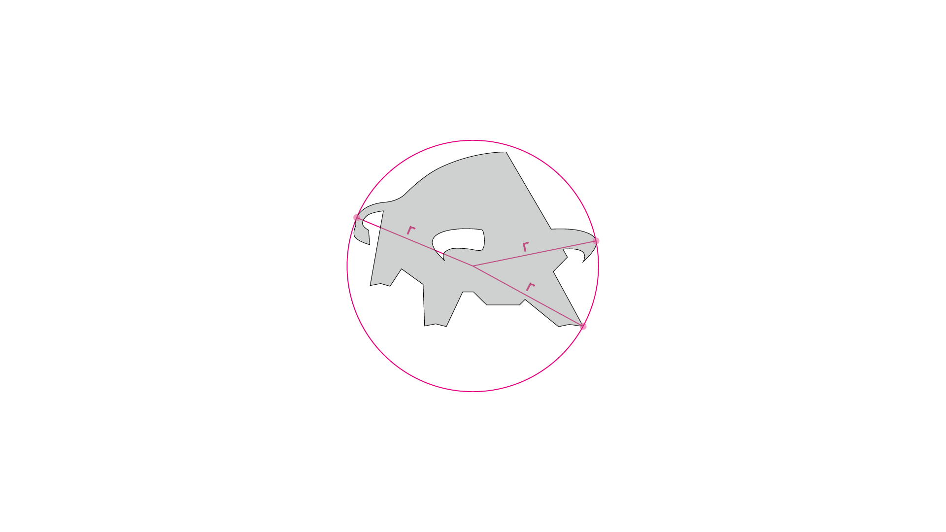
- The Tangential Cut: A circumcircle was placed around the silhouette of the bull, tangent to exactly three outer edges. Using these three points, the geometric center and radius were determined.
- The Base Unit: The radius was divided by 10 (x = R / 10). This relative module formed the closed inertial system of the logo.
- The Spatial Gain (2x): The distance between the bull silhouette and the circular boundary was doubled. The animal gained physical stability and visual white space.
- Liberation of the Wordmark: The historic PREFA lettering remained unchanged in its form, but was spatially repositioned: The top edge was distanced exactly 6x from the center, and the bottom edge was positioned at a distance of exactly 1x from the circle line.
The optical center
Your own unit of measurement
Room to breathe
The final anchoring
The Formula System
The Law of 57 Units
To eliminate manual measurements, time-consuming preparation, and arbitrary decisions across 16 European national subsidiaries, I discarded static millimeter tables. Based on a 12-column layout, I developed a proportional grid system.
The Proportional Derivation
A classic 12-column layout requires columns, gutters, and outer margins. Setting the relative width of a column to 3x, the column spacing to 1x, and each of the two outer margins to 5x, the total width is calculated through simple addition:
- 12 columns at 3x each = 36x
- 11 gutters at 1x each = 11x
- 2 margins at 5x each = 10x
- Total: 36x + 11x + 10x = 57x units
- Dynamic Base Units: The module sizes are calculated directly from format width divided by 57 and format height divided by 57.
- Systemic Anchoring: Margins (5x), columns (3x), gutters (1x), standard logo width (7x), callouts (13x), and URL width (9x) snap directly to the calculated modules.
Interactive display of the PREFA 57 grid: 5x margins, 12 columns of 3x with 1x gutters, logo 7x and URL 9x on A4 portrait, A4 landscape, poster, PowerPoint slide, and LA4 folder.
Every format is divided by 57 in width and height. Change the format: grid, logo, and URL move with it – and the logo remains exactly 7x in size in both portrait and landscape format.
Target Audience Tone
Image-Text Balance Instead of Brand Splitting
PREFA serves two opposing worlds: pragmatic craftsmen and tinsmiths on the one hand, discerning architects on the other. Instead of splitting the brand, the corporate design controls perception through weighting within the same grid:
Trades & Installers
In the installer and B2C segment, high-visibility PREFA Red (CMYK 0/100/100/0), bold slanted callouts, and prominently featured warranty logos (40-year material and color warranty) dominate. The typography is led by the powerful DIN Pro Condensed Black.
Architecture & Planning
On image pages and reference documentation, the branding recedes discreetly. The color palette focuses on the neutral shades PREFA Gray 01 to 05. Callouts are integrated in circular and monochrome formats, while warranty logos are eliminated by default to let the pure architectural texture of the building take center stage. The body text in the warm ITC Slimbach Antiqua enters into a balanced dialogue with the imagery.
Microtypography & Language Overhaul
- The NOT Sign as an Architectural Motif: As a replacement for the loud exclamation mark, I established the mathematical negation sign ¬ (Unicode 00AC) as a bullet point. Formally, it references the profiled roof edge, the standing seam, and the right-angled edge offset of facade panels. At the same time, it directly corresponds to the corporate line, which acts as a dividing rule between headline and subline.
- Internationalization (CE Upgrade): The corporate typeface ITC Slimbach originally lacked support for Eastern European languages. Through group-wide licensing and the transition to ITC Slimbach Pro / CE, 16 European national markets were typographically standardized and enabled for accessible communication.
The Stress Test
Complete Catalog 2020
The practical acid test took place under real-time conditions: While the design system definitions were being finalized, I simultaneously implemented the 100-page Complete Catalog 2020 using native InDesign structures. The system proved its robustness here: no days-long preparations or time-consuming measuring – drag out the grid, place the logo and text containers, produce.
The Hurdle: Double-Page Spread “10 Good Reasons”
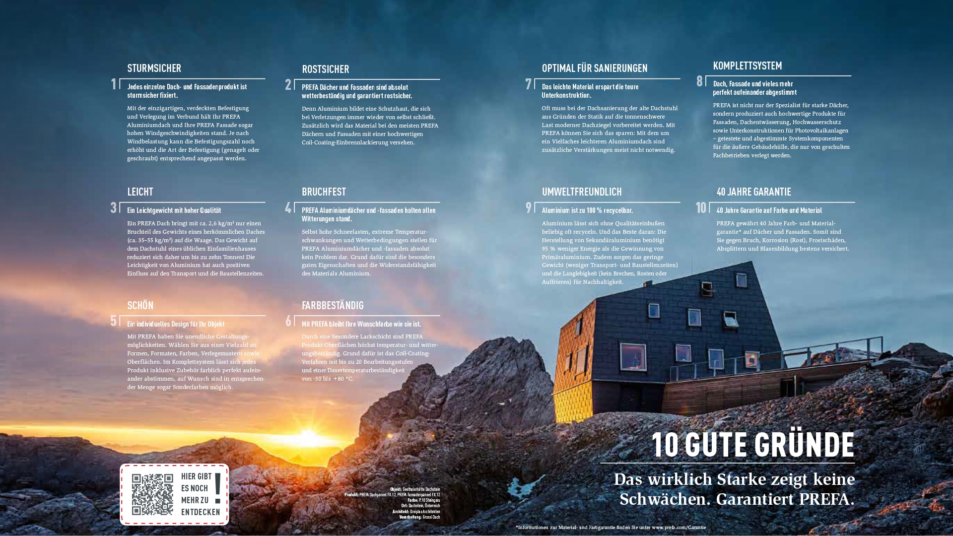
On pages 10 and 11, information density culminated under extreme conditions: Ten independent argument blocks, value propositions, QR code callouts, and project references had to be placed on a single, full-bleed panoramic photo of the Seethalerhütte on the Dachstein (2,740 m).
Instead of dissecting the image with artificial text boxes, the entire photograph was utilized as an open space:
- Asymmetrical text flow: The ten arguments are distributed organically across the calm sky area above the rock massif – six points on the left of page 10 (divided into two columns of three lines each: 1 to 6) and four points at the top right of page 11 (in two columns of two lines each: 7 to 10).
- Typographic integration: Each point is introduced by a striking, large numeral in DIN Pro, which transitions directly into the headline via a delicate white line. All text is set in pure white with optimal contrast directly over the atmospheric twilight mood of the mountains.
- Dramaturgical conclusion: The lower-right half of the image belongs, uncropped, to the alpine mountain hut. Immediately below it, the monumental headline block in bold DIN Pro (“10 GOOD REASONS”) and the subline in Slimbach (“True strength shows no weakness. Guaranteed PREFA.”) anchor the entire double-page spread, while the dashed callout with QR code at the bottom left forms the transition into in-depth digital content.
Modular Scaling
Vector Systems, Brand Extensions & HUD
The practical viability of the system became evident in the subsequent expansion stages and system extensions:
Supporting Graphics & Vector System
To permanently eliminate heterogeneous stock graphics and visual clutter, I designed a proprietary illustration and animation system:
- Grid Logic: Icons on a strict 48px * 48px grid, pictograms on 128px * 128px with exactly 2px cutout clearance for overlapping objects to achieve dimensional depth entirely without shadow effects.
- Color System: A palette of 24 base colors across three brightness levels each (72 shades), directly derived from real product paint finishes (Oxide Red, Moss Green, P.10 Stone Grey) including "Almost White" for white backgrounds.
- Character Anatomy: Faceless characters with joint points for puppet animations to enable fast, consistent explainer video production without stylistic outliers.
Brand Extensions in a Closed System
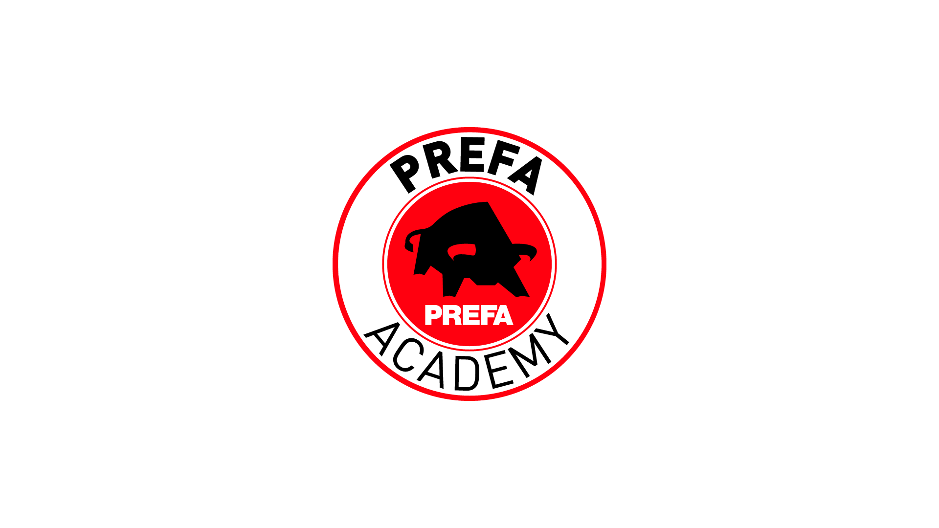
- PREFA Academy: Designed as a concentric seal badge – the recalibrated bull at its core, the parent wordmark at the top, and ACADEMY in arched DIN Pro below. The crest lends academic dignity to the trade training system.
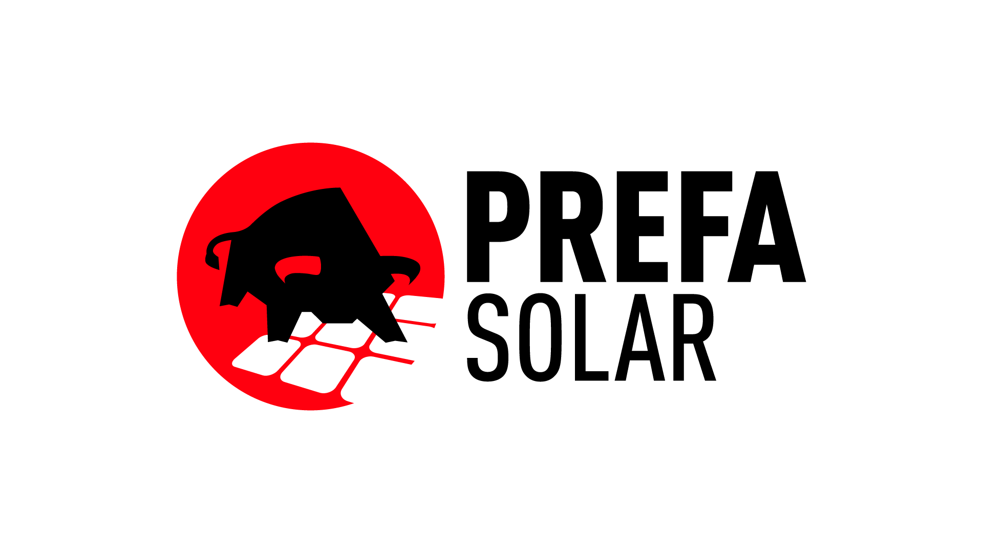
- PREFA SOLAR: As the photovoltaic roof tile was positioned as a core product of the future, PREFA SOLAR was elevated directly to the level of the parent brand.
- PREFA TeamNet: For the internal employee portal, two dialogical speech bubbles merged with the silhouette of the bull's head; the tails of the bubbles precisely trace the curve of the bull's horns.
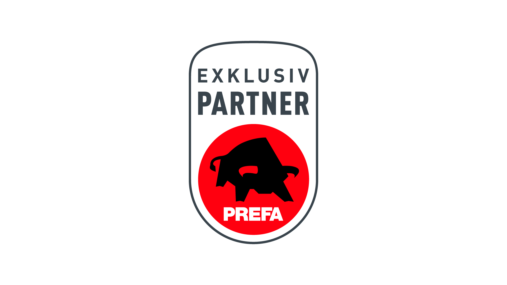
- Exclusive Partner Badge: The seal of quality for specialist businesses translates the logo's 'x' into a high-quality vertical plaque with defined radii and precisely inset text ribbons.

The Interactive PowerPoint HUD
For training sessions and workshops (“Digital.Jetzt!”), I developed a non-linear navigation interface directly in Microsoft PowerPoint. A radial menu, segmented with the scale texture of the characteristic aluminum wall rhombuses, fans out sub-processes with a click, focuses topics, and brings the respective pictograms to the center.
Conclusion
The Evolution in Direct Comparison
Brand Claim
- Before (2015): Restrictive and category-specific ("The roof...")
- After (2020): Category-free quality proposition ("Strong as a bull")
Logo & Heraldic Animal
- Before (2015): Unstable tipping point, cramped wordmark at the circle's edge
- After (2020): Centered across three tangents, doubled clear space, geometrically stabilized
Layout Grid
- Before (2015): Rigid, error-prone millimeter specifications per format class
- After (2020): Universal 57-grid as a proportional bridge between print and digital
Microtypography
- Before (2015): Promotionally loud exclamation mark (!) as a bullet point
- After (2020): Architectural NOT sign (¬), derived from the folded seam
Graphic Assets
- Before (2015): Fragmented, stylistically inconsistent stock elements
- After (2020): Cohesive vector ecosystem with 72 shades derived from actual product colors
Media Horizon
- Before (2015): Heavily print-focused, additive set of rules
- After (2020): Scalable across print, web, moving image, apps, and interactive HUD presentations